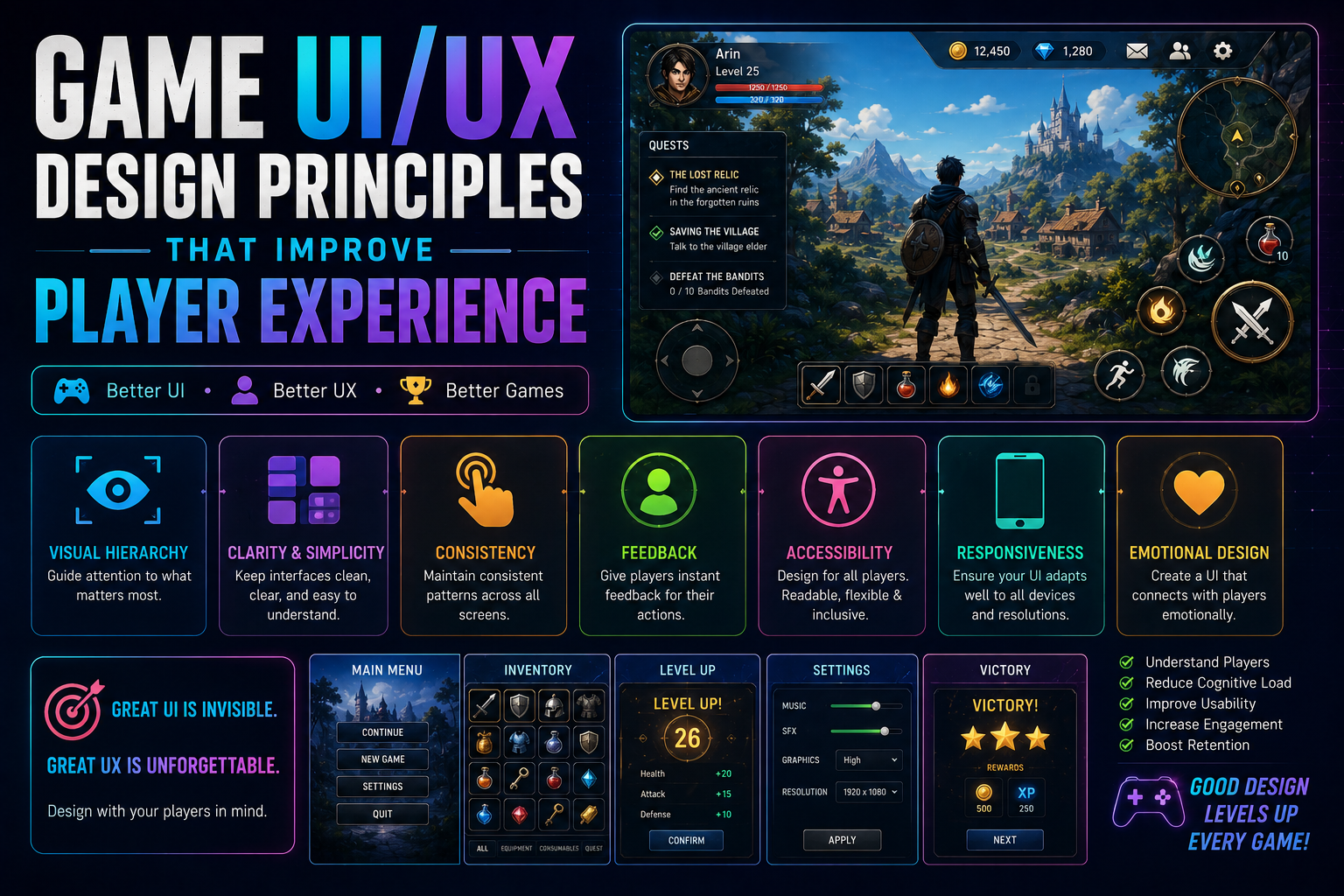
Game UI and UX are more than making menus look attractive. A well-designed interface helps players understand the game, make decisions quickly, and stay immersed in the experience.
Whether you’re building a mobile game, indie PC title, console game, or multiplayer experience, thoughtful UI/UX can make a significant difference.
1. Keep the Interface Simple
Players shouldn’t have to think about how to use your interface.
Use clear labels, familiar icons, logical layouts, and consistent interactions. Remove unnecessary elements that compete for the player’s attention.
A good rule is:
Show players what they need, when they need it.
For example, a health bar should be easy to identify without forcing the player to stop playing and search the screen.
2. Create a Clear Visual Hierarchy
Not every element on the screen has equal importance.
Use size, contrast, spacing, position, and animation to communicate priority.
For example:
- Health and critical status → highly visible
- Mission objectives → noticeable but unobtrusive
- Secondary information → smaller or less prominent
- Decorative elements → should never overpower gameplay
This allows players to understand the interface almost instantly.
3. Design for the Game’s Platform
UI that works on PC may not work well on mobile or console.
Consider:
- Screen size
- Input method
- Touch targets
- Controller navigation
- Resolution
- Viewing distance
- Aspect ratios
For mobile games especially, buttons should be large enough to tap comfortably and positioned where players can reach them naturally.
4. Give Immediate Feedback
Every important player action should produce feedback.
Examples include:
- Button animations
- Sound effects
- Controller vibration
- Damage indicators
- Hit effects
- Progress animations
- Menu transitions
Feedback reassures players that the game has registered their action.
5. Maintain Consistency
Players learn your interface through repetition.
If one button opens a menu in one location, it shouldn’t perform a completely different action somewhere else.
Keep these consistent:
- Button styles
- Icons
- Fonts
- Colors
- Navigation
- Interaction behavior
- Terminology
Consistency reduces the player’s cognitive load.
6. Don’t Interrupt Gameplay unnecessarily
Menus and notifications should support gameplay rather than constantly interrupt it.
Instead of stopping the game for every message, consider subtle notifications, contextual UI, or temporary indicators.
This is especially important in action games where players need to maintain concentration.
7. Use Color With Purpose
Color can communicate information quickly.
For example:
Green: Safe, positive, available
Yellow: Warning, attention
Red: Danger, damage, unavailable
Blue: Information or interaction
However, don’t rely exclusively on color. Players with color-vision deficiencies should still be able to understand the interface through icons, shapes, text, or patterns.
8. Make Navigation Predictable
Players should always understand:
Where am I?
Where can I go?
How do I go back?
A good navigation system minimizes unnecessary steps.
For example:
Main Menu → Play → Level Select → Level
Avoid unnecessarily complicated structures such as:
Main Menu → Game → Options → Levels → Back → Select → Play
9. Design Effective HUDs
The HUD should provide useful information without covering important gameplay.
Common HUD elements include:
- Health
- Stamina
- Ammo
- Minimap
- Objectives
- Abilities
- Currency
- Inventory
- Quest information
Consider allowing players to customize or hide non-essential HUD elements.
10. Consider Accessibility
Accessible UI isn’t just an optional feature. It can make your game usable by a much larger audience.
Consider supporting:
- Adjustable text size
- Subtitles
- Colorblind-friendly indicators
- Remappable controls
- Controller support
- Reduced flashing effects
- Screen-reader-friendly menus where appropriate
- Adjustable UI scale
11. Test With Real Players
Developers become familiar with their own interfaces, which can hide usability problems.
Playtesting can reveal issues such as:
- Players missing important buttons
- Confusing terminology
- Poor menu navigation
- Difficult-to-read text
- Overloaded HUDs
- Unclear objectives
Watch what players do, not just what they tell you.
If several players struggle with the same interaction, the interface probably needs improvement.
12. Use UI/UX to Strengthen Immersion
The best game interfaces feel like part of the game rather than something placed on top of it.
A fantasy RPG might use parchment-style menus, while a futuristic shooter could use holographic interfaces and animated panels.
However, visual style should never come at the expense of usability.
Function first. Style second.
Final Thoughts
Great game UI/UX is about reducing friction between the player and the experience.
Players should understand what is happening, know what they can do, and receive clear feedback without constantly thinking about the interface itself.
Whether you’re developing your next Unity project or designing a large multiplayer game, start with clarity, consistency, feedback, accessibility, and playtesting.
A beautiful interface is good.
An interface that players don’t have to think about is better.